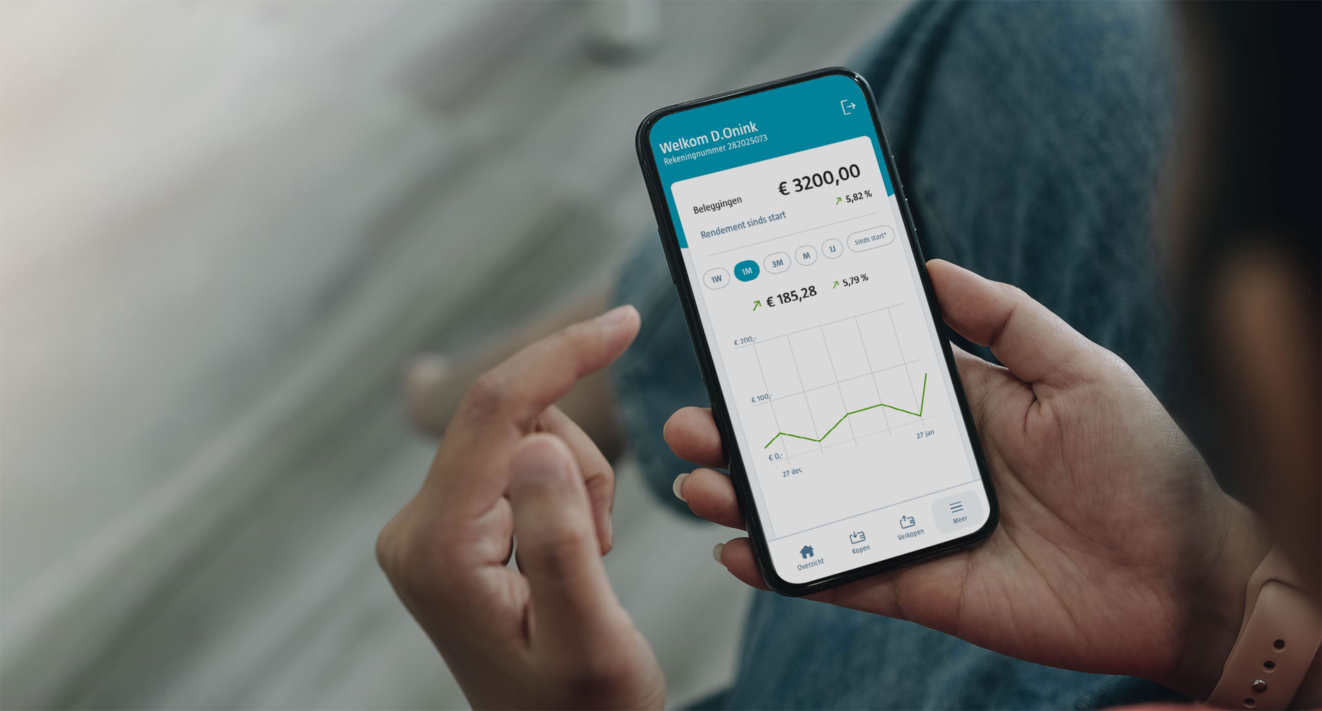
Client
ROBECO
Timeline
4 Months
Website
End of an Era
Robeco Discontinues Its Savings Account Feature: A Major Impact on Services and Customer Usage. This was one of the most impactful cases I worked on at Robeco. It presents an interesting scenario, illustrating the complexity of the service and how business goals sometimes diverge from customers' goals.
The savings account feature, integral to our clients' investment accounts, served not only for saving money but also for depositing sales proceeds and deducting fees. The challenge lay in making this transition as painless as possible for our customers.
The change presented several challenges for our customers
Our first step was to deeply understand the impact of this change on our clients. The removal of the savings component meant our clients could no longer use it for their routine financial activities, such as holding savings, using the balance for buying and selling funds, handling service fees, and managing cash dividends. Recognising these issues was crucial in shaping our approach to find alternative solutions.
Together with the team, we reviewed all aspects of our service where the savings component plays a part. We found 5 major problems we had to work on.
01
Customers can no longer maintain savings
02
Customers are unable to trade using their Savings Balance
03
Fees can no longer be deducted from the Savings Balance
04
Customers can no longer use the direct debit method to transfer money into the wallet which holds the savings balance
05
No cash dividends can be paid out on the savings balance
There was one problem that affected our customers but would affect the business even more
For customers needing quick cash for big purchases, Robeco's new system is more efficient, as funds from sold investments are now directly transferred to their bank accounts, bypassing intermediary accounts. However, for those wanting to exit investments temporarily due to market downturns, this setup is less convenient. They receive funds directly in their bank accounts, necessitating additional steps to reinvest. From Robeco's viewpoint, this approach poses a challenge. Money expected to be reinvested becomes less visible, increasing the risk of customers either not reinvesting or choosing other banks for their investment needs.
Hypothesis
'If we make it easy for people to reinvest their money directly after they sell funds, they are less likely to transfer it to their bank account.'
How might we enable customers to reinvest their money directly after they have sold funds?
To answer this question we needed to learn the factors that influence our customers' investment decisions, particularly regarding the reinvestment of proceeds from fund sales. Our approach was multi-faceted, addressing both mental and logistical barriers.
Mental Barriers
We looked into what prevents people from immediately reinvesting their money. This involved exploring the psychological aspects of investment decisions, such as risk tolerance and the impact of market fluctuations on investor confidence.
Logistical Barriers
Another aspect of our study was to determine the best way to incorporate the reinvestment option into the user flow. We aimed to make this process as straightforward as possible for our customers. We wanted to identify the optimal time and place to introduce this option, ensuring it doesn't interfere with their current task of selling their funds.
Talking to our customers
To get an idea of how customers would react to the discontinuation of our savings service and what challenges they might face, we organized a day where we invited 7 customers to go through a prototype via Teams. During this conversation, one of the topics we wanted to test was the immediate purchase associated with selling as mentioned above.
Working backwards
We created a Figma prototype of the new situation and asked customers to perform their usual tasks. This way, we could observe their reactions when they unexpectedly encountered the possible changes.
We created a Figma prototype of the new situation and asked customers to perform their usual tasks. This way, we could observe their reactions when they unexpectedly encountered the possible changes.
When selling, most people don't think of buying. Therefore all nudges in the sell flow create confusion
We found that when people are selling their funds, they usually aren't considering buying new ones immediately. Therefore, any prompts or nudges within the selling process that encourage buying new funds with their sales proceeds tend to only cause confusion.
Moving forward
We decided not to include any prompts in the selling proces but have the user finish the sale first and then have them decide if they want to cash their money or invest it in right away.
When deciding to sell, people tend to prioritise short-term stress relief over long-term profit
When people sell due to falling stock prices, they experience stress. This stress makes them less inclined to carefully consider the potential long-term benefits of holding onto their funds. Once they have decided to sell, we see few opportunities to counter this with UX solutions without venturing into the realm of dark patterns.
Moving forward
We decided to inform people about the disadvantages of selling when stock prices are low. Since we saw little opportunity to influence customers on the client dashboard, we chose to address this through our marketing channels.
Final design
After deciding to let customers complete their task before offering them the opportunity to purchase new funds, we developed multiple scenarios in a Figma prototype. These scenarios included cases where the purchase amount is equal to the sale amount, the purchase amount is greater than the sale amount, and the purchase amount is less than the sale amount.
The primary purpose of this prototype was to ensure team alignment on functionality and to facilitate sharing within the broader organization.
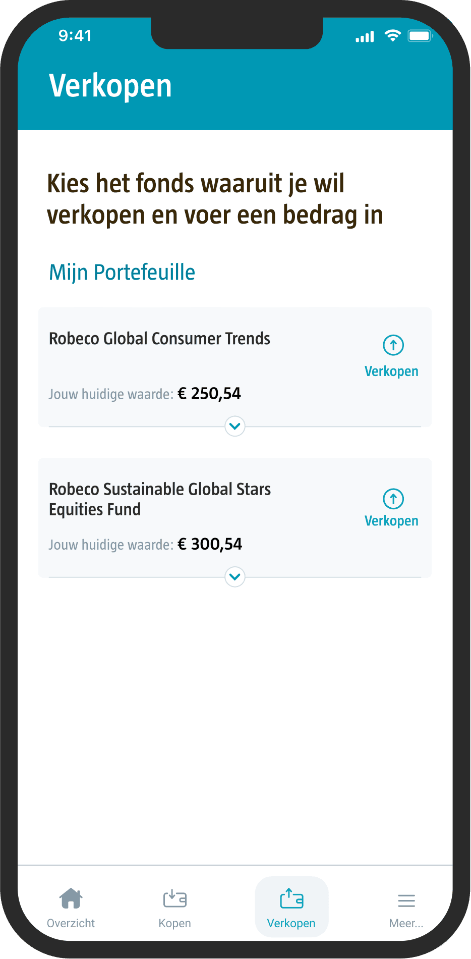
The prototype below illustrates one of these scenarios: where the purchase amount is equal to the sale amount.
Bob Keizer - Product owner
Jens Steenhuis - CX manager
Hans Maessen - VP of Marketing
Demmy Onink - Product Designer
Yuri De Snaijer - Front End Developer
In this project, my role involved overseeing the transition strategy after Robeco discontinued its savings feature. I focused on understanding customer impacts, developing alternative solutions, testing assumptions through customer feedback, and refining the user experience to adapt to the new situation.


